ROLE:
Team lead, UX designer,
User researcher
WCAG Target Size:
100% of elements meet AA
24x24 CSS pixels
up from 55%
~60% of elements meet AAA
44x44 CSS pixels
Up from 20%
Adheres to success criterion 2.5.5 as defined by the W3.
WCAG Contrast:
100% of elements meet AA
(3: 1 for large text)
(4.5: 1 for large text)
~80% of elements meet AAA
(4.5: 1 for large text)
(7:1 for small text)]
Adheres to success criterion 1.4.3 as defined by the W3.
TIMELINE:
September- December 2024
TEAM:
3 UX Designers
1 User Researcher
SKILLS:
Accessible design
Usability testing
UX Prototyping
Overview
Ridleys Family Markets is a grocery store chain in the Midwest United States. The companion app for Android by the same name had low ratings in the google play store because many users complained that the app was slow, unresponsive, and difficult to navigate.
Solution
My team and I could not directly solve the apps performance issues directly, as this redesign was part of a study on interaction design assigned to us as part of Dr. Baharul Islam’s Human-Computer Interaction course. However, we did create an interactive prototype in Figma with carefully planned page navigation, adhering to best practice within the information architecture design paradigm. We also worked to improve the app’s contrast and the target size for interactable buttons, as these are crucial to making the app accessible to the visually impaired and seniors, which are a key part of Ridleys customer demographic.
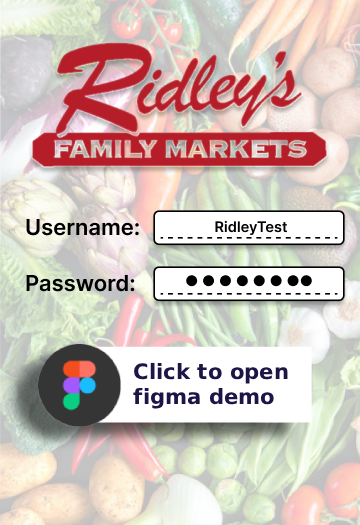
Click/Tap on me to see the redesign!
Outcomes
Usability Scores from User Testing:
F, 52 y.o: 7.5/10
M, 72 y.o: 8/10
M, 22 y.o: 9/10
M, 18 y.o: 7.5/10
All ages: 8/10
<50: 7.8/10
>30: 8.3/10
Initial Findings
The app lacks a central area where users can access core functionality, uses complex background images and has small buttons. These factors make navigating the app’s pages overwhelming and tiresome.
To identify the areas most in need of improvement, we conducted usability testing with our teams’ members and 4 non-team members. We also conducted analyses on target size & contrast.
Initial survey results:
4 users were confused by the home screen because of the layout of the sidebar.
2 user was unclear on the purpose of the coupon collection and what separates deals from coupons.
1 user stated that the accounts page was confusing, and that the membership verification barcode should be more accessible.
1 user said that the app’s homepage was too crowded and detailed.
Changes in Figma Design
Changes to address stakeholder concerns:
Removed Sidebar
Replaced sticky toolbar with tile menu & nav bar
Created settings page for new accessibility options & QoL fixes
Moved accounts page & store location into account settings
Moved membership verification barcode to home page
Changes made to address accessibility concerns:
Simplified color palette
16+ -> 5 main colors
Enhanced contrast between elements to 4.5:1 or greater
wherever possible within limited palette
Increased size of interactive elements to 44x44 pixels
wherever possible given confines of screen real estate
Prototype Features
Prototype Design:
The prototype was built around 4 main sections of the app:
Hot Deals (renamed from Personal Deals)
Add Coupons (renamed from Collections)
Rewards (Merged Punch Card & Advantage Points)
Support
And 2 secondary sections:
Settings
Activated coupons (renamed from My List)
The former are accessed through large tiles on the home page. The latter can be visited using the adaptive navigation bar, whose options change depending on the needs of the current page.
Interactive Functionality:
Navigation bar with tappable icons
Back, Home, Sign Out, Activated Coupons & Settings
Tracks quantity of added coupons
Tapping the +/- button in Add Coupons page changes count of coupon in Activated Coupons
User Feedback & Changes
Here are a couple examples of the feedback-iteration process
User A (52 y.o. F)
“It was unclear where I would end up after tapping on a new section on the support screen”.
Changes made: Added descriptive labels to each tile on the support screen.
2. “The hot deals icon in the shopping cart was confusing. Am I on the Hot Deals Page or will it direct me back to the Hot Deals page?”
Changes made: Removed the “back to hot deals icon” in favor of a generic back button that can be used on any page.
3. “Is the barcode button at the bottom of the home page meant for scanning items? Oh it’s for them to check your membership?”
Changes made: Inserted barcode as static item to make it seem less like a separate action. Hopefully this will reduce confusion and make the itended purpose (used by greeters to verify membership status) more clear.
User B (18 y.o. M)
“Why not have a tab in the settings page for account settings? Then all of the app’s settings could be found in one place.”
Changes made: Moved account related settings from accounts tile into a dedicated section of the settings page.
2. “It’s kind of crazy that deleting your account and resetting your password can be done with a couple of taps, it’s almost too easy to make major changes to your account.
Changes made: Confirmation pop-ups now appear when resetting your password or when deleting your account.
Reflection
Skills I learned:
Interactive Prototyping in Figma
User research
Information Architecture Design
This is the study of what dictates a logical flow of information
In this case, I overhauled page navigation & moved key info into logically related sections
What went well:
Prototype quality was excellent
Design is highly accessible to visually impaired
Simplified interface still fits all key functions on the home page
All participants surveyed preferred the redesign
What could be improved:
Add more interactive features outside of page navigation
Could have utilized Figma styling to create light/dark/high-contrast viewing modes
Design may be too minimalist, loss of some brand identity