Wine Quality Modeling with K-Nearest Neighbors
ROLE:
Lead developer
TIMELINE:
October- November 2024
TEAM:
3 Developers
SKILLS:
Data Mining
Predictive Analytics
Business Insight
Project Overview
This project is an attempt to model wine preferences from only their physicochemical properties: alcohol, sulphates, sugars, etc. Our testing and training data consists of 6000+ entries, white and red Vinho Verde wine samples (from Portugal) and participants’ scores for perceived wine’s quality. The data used for this project was sourced from UC Irvine’s Machine Learning Repository.
Data Overview
Source: Two CSV files, winequality-red.csv and winequality-white.csv, merged into a single dataset.
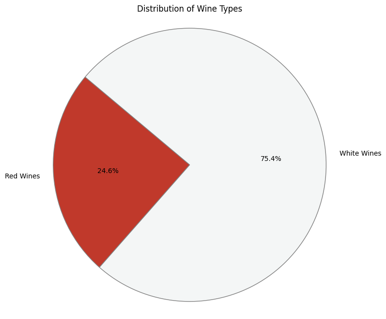
Total wine samples: 6497
Red Wines- 1599
White Wines- 4898
Features (11):
fixed acidity
volatile acidity
citric acid
residual sugar
chlorides
free sulfur dioxide
total sulfur dioxide
density
pH
sulphates
alcohol
Original Target Variable: quality (score between 3 and 9).
Distribution:
3/10: 0.46%
4/10: 3.32%
5/10: 32.91%
6/10: 43.65%
7/10: 16.61%
8/10: 2.97%
9/10: 0.08%
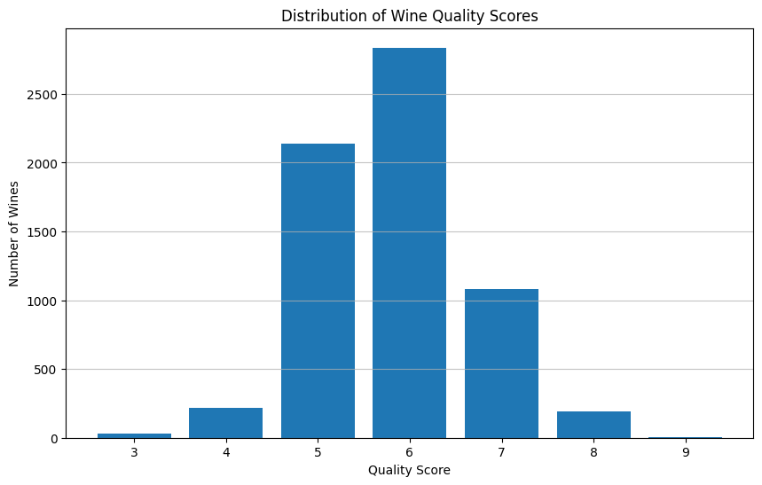
Observation: The dataset is heavily imbalanced, with the vast majority of wines scoring 5 or 6.
Methodology
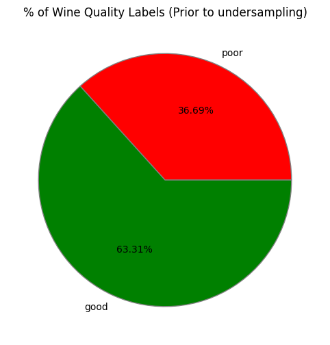
Discretize data
Perceived quality scores are given out of 10
To create labels, we sort values into 2 groups
3-5 -> Poor quality 6-9 Excellent quality
These class boundaries were chosen because:
no quality scores lower than 3 or higher than 9
they created similar sized groups for poor & good quality
2. Clean-up Data
Label features separated from training data
42% Normal quality wines dropped to match poor wine count
balanced dataset yields more accurate classification results
All features scaled to [0,1]
to ensure equal contribution of features
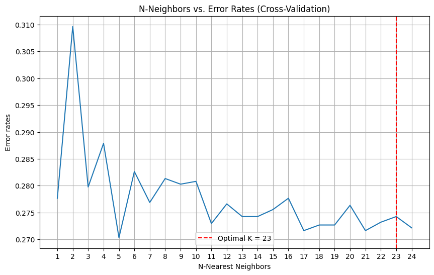
3. Optimize K-value
Determine optimal k-value via elbow graph
Error rate vs. k-value
Maximize k-value within range to prevent overfitting
Large datasets suffer from overfitting with low k-values
Minimize error rate
Optimal value found to be k=23
4. Classify Data
Fit training data to KNN model with
empirically optimal k=23
80-20 train-test-split
Use fitted model to predict labels for test set
5. Evaluate Model
The model’s classification performance is analyzed via the following:
Accuracy score
Precision score
Recall score
F1-Macro
Confusion matrix
6. Results Validation
Create decision boundary graph to verify optimal fitting
If overfitted, test other local minima in k-value graph
Modeling Results
1.Model Metrics
Accuracy Score: 0.7673 ≈ 76.7%
Precision Score: 0.7672 ≈ 76.7%
Recall Score: 0.7673 ≈ 76.7%
F1-Macro: 0.7673 ≈ 76.7%
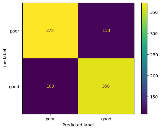
2.Confusion Matrix
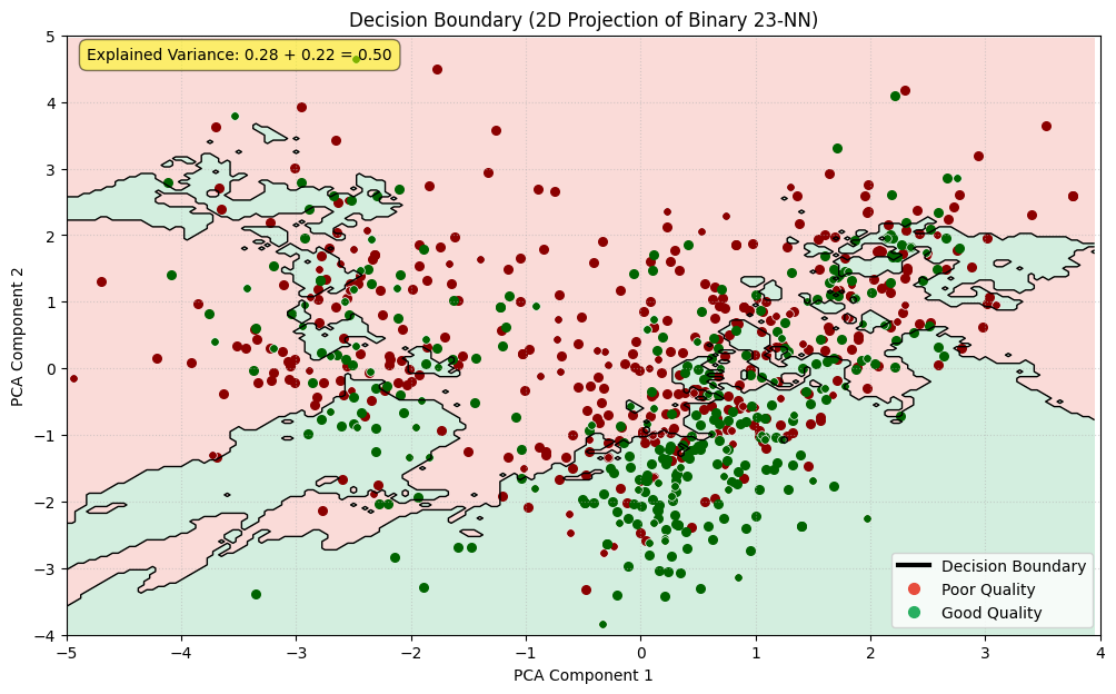
3.Decision Boundary
Strengths & Limitations
Strengths of our approach:
Binary label bins create even class distribution
Optimal K-value is found empirically & cross-validated
K-NN model generalizes well to unseen data
Limitations of our approach:
Only 2 clusters: ‘poor’ and ‘good’ quality
Model is unable to predict degree of good/poor quality
No separate evaluation of models trained on only red or white wine samples
Loss of info from dimensionality reduction makes decision boundary graph hard to interpret
Reflection
What went well:
Project development was rapid and smooth
members were attentive during sprint meetings
initial experimentation period helped refine our training parameters
We expanded simple concept into a robust exploration of wine quality modeling
Taught all of us about value of cross-validation
How to minimize lurking variables & sampling bias
Visualization methods for higher-order data
What could be improved:
No separate insights into red and white wine data
datasets were combined to increase size of training data
time constraints prevented us from adding this after completing 1st working build
Decision boundary graph is difficult to interpret
dimensionally reduced dataset loses detail
does not appear to be a good approximation of full dataset
but full data cannot be graphed
And predicting from projected data has substantially worse performance
Implementation of elbow graph may be flawed
Maximizing k may not have been the right choice
Hard to check for underfitting without a clear metric
Perhaps silhouette score would have been better than graphing the decision boundary