Ridley’s Family Market:
Redesigning for Usability & Accessibility
What is this project?
I redesigned the Android app for Ridley’s Family Markets, a grocery-store chain in the Midwest United States. This design was created for the final project of Dr. Baharul Islam’s Human-Computer Interaction course.
For this project, our class was tasked with redesigning a poorly-rated mobile app, with a focus on 2 UI design principles of our choice.
Why choose Ridleys?
I found the Ridley’s Market Android app by searching the google play store for apps with reviews containing phrases like “poor UX” and “difficult to use”.
The Ridley’s family market app was rated 3.1 stars, many reviews discussed difficulty accessing key functionality like coupons and the barcode for mobile self-checkout being missing, or non-functional.
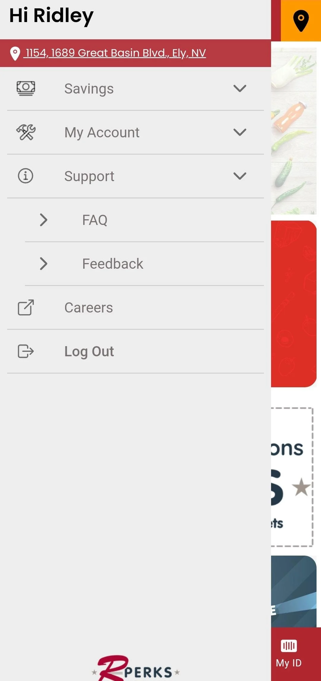
After downloading the app myself, I was shocked by the app’s disordered structure. Key functionality like accessing your account settings or saved coupons was obfuscated behind nested menus in an unlabeled sidebar. The toolbar was designed more approachably with labels and icons, but was grossly underutilized in favor of a list-style menu on the home screen.
What design principles were utilized?
Contrast
Alignment
Progressive Disclosure
Proximity
What design paradigms did this project focus on?
Information Architecture Design
Accessible Design
Original Mobile App Design
This design excels at:
Creating a cohesive brand identity
Consistent color palette & imagery
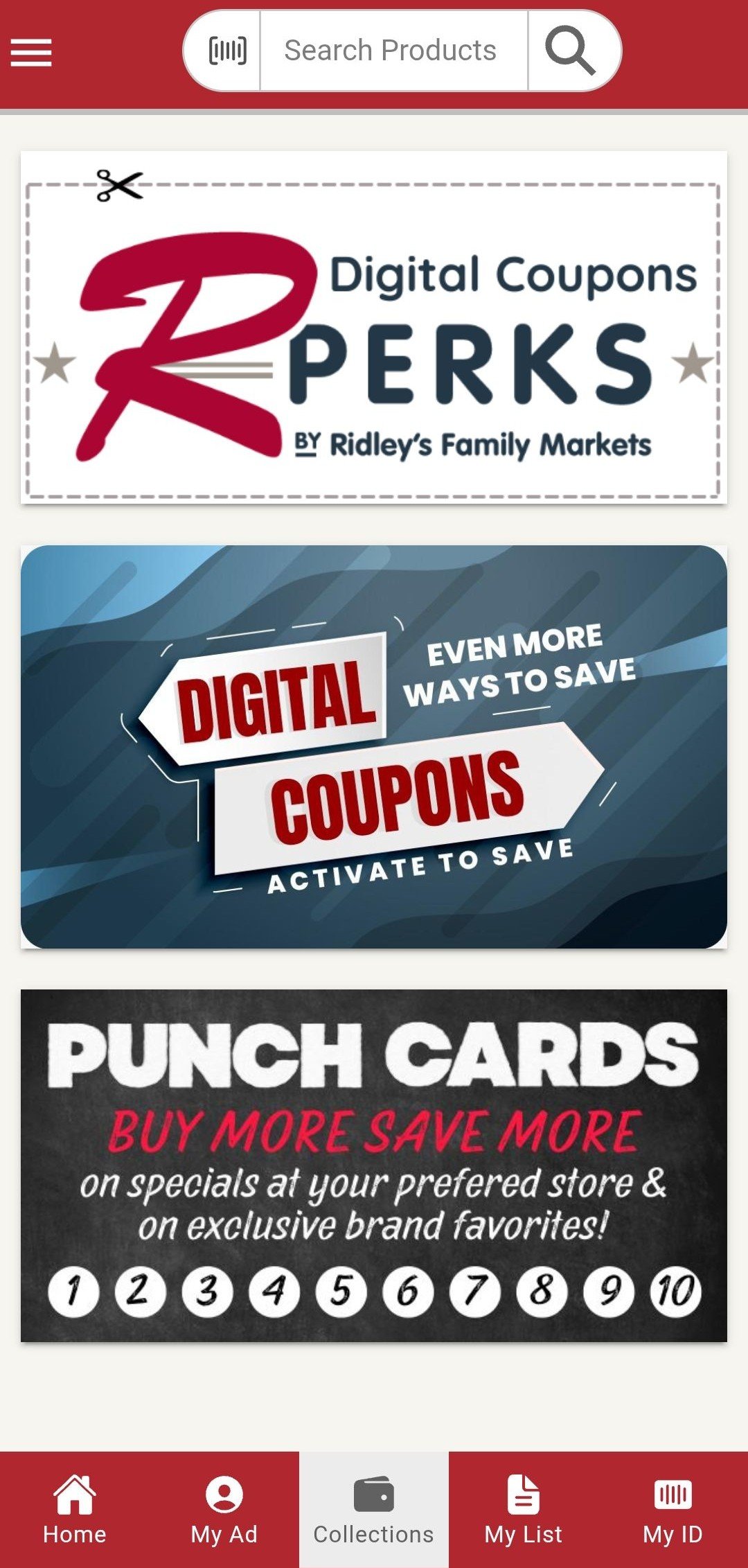
The burgundy color taken from their logo is striking and has excellent contrast with the light grays and whites that pervade the design. Images of produce reinforce the family-oriented, home grown brand image that Ridley’s family market has built up since 1984.
This design struggles with:
Progressive disclosure
Every iota of functionality available in the app is shown to the user up-front on the homepage. This violates the principle of progressive disclosure, which dictates that users should have a small set of clear choices shown to them at any given time. The sidebar menu and toolbar need to be consolidated.
2. Proximity
This app fails to group related functionality effectively. The Savings, My Account, and Support tabs are a good attempt at this, but the savings tab groups disparate sections of the app like “My Savings” which directs to the “My ID tab” and the “Rewards” tab, which is only loosely related “Personal Ad” tab through their intent to save the customer money.
3. Visual hierarchy (contrast, emphasis, & spacing)
While the abundance of deep red creates a strong brand image, it also means the high-contrast white-on-red top and bottom toolbars fight for the user’s attention. The tightly spaced options in the sidebar, further clutter the the hierarchy. Core functionality like the personal ad, digital coupons, and rewards should be emphasized, while secondary functionality like ID, support and the shopping cart (“My List”) should be de-emphasized.
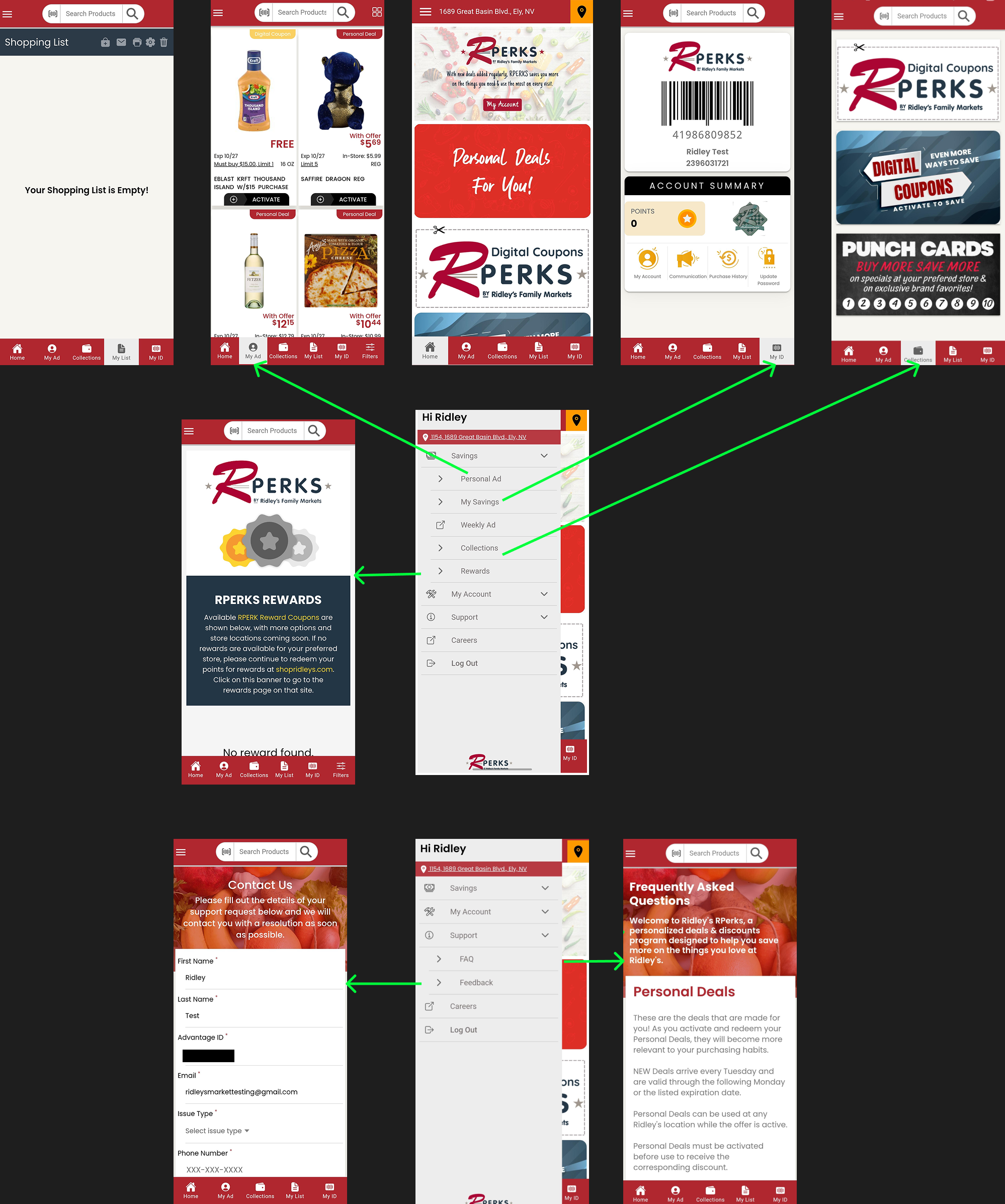
A simple sitemap of the original design (created in figma)
——> Green arrows show duplicated functionality
My Proposed Redesign
Changes made for usability:
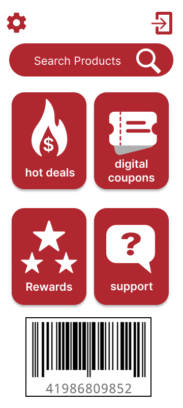
Mobile checkout barcode included on homepage
Changes made for progressive disclosure:
“Change store location” option moved into settings
Most people frequent the same store
Secondary functionality moved away from homepage
Shopping cart icon only appears on screens where products/coupons be be selected
Condensed sticky toolbar & side menu into button grid & nav bar
Changes made for accessibility:
Icon & font size increased substantially
Aligned with WCAG target & font size standards
crucial for accessibility
Limitations of the new design:
Weakened brand identity
While simplifying the interface design reduced visual clutter and allowed core functionality to use more screen real estate, the new minimalist aesthetic moves away from the rustic, grassroots brand identity Ridley’s is trying to cultivate.
May violate principle of multiple classifications
Removing the sidebar means that users are required to use the navigation bar and button grid to access the app’s contents. Catering to various browsing preferences is key to creating a user-centered experience.
Home page
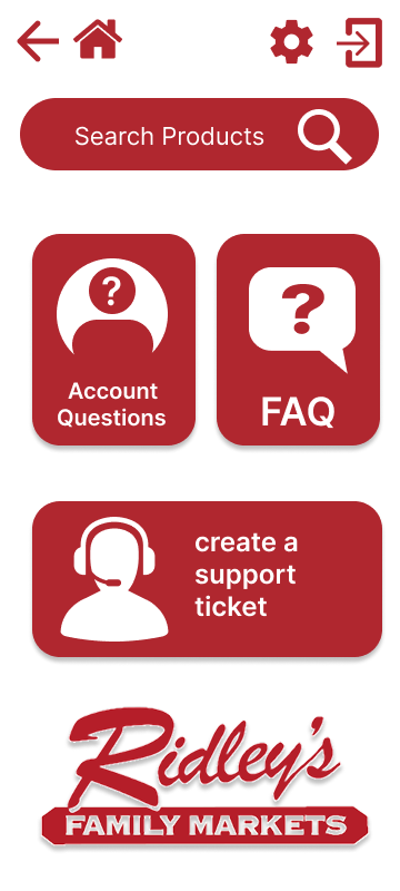
Support page
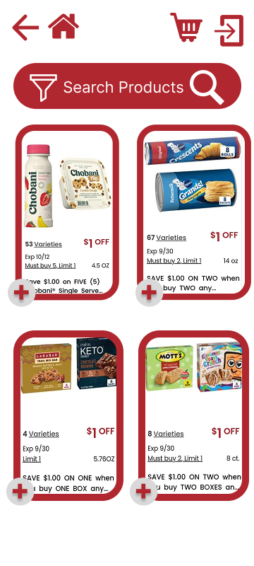
Hot deals
Original vs. Redesigned Sitemap
A simple sitemap of the original design (created in figma)
——> Green arrows show duplicated functionality